Context
Qubik is an e-learning startup focused on modular education — offering bite-sized, stackable courses designed for modern learners and fast-paced industries. They needed a brand that communicated intelligence and structure without feeling sterile, and that could flex across both corporate clients and independent users.
Our approach
We grounded the brand in the idea of modularity — small components that build into something bigger. The name Qubik reflects this: geometric, compact, and tech-forward. From strategy to visuals, everything was shaped around the theme of structured learning that remains human and approachable.
We positioned Qubik as a tool, not just a platform — something users could build with, on their terms.
Visual identity
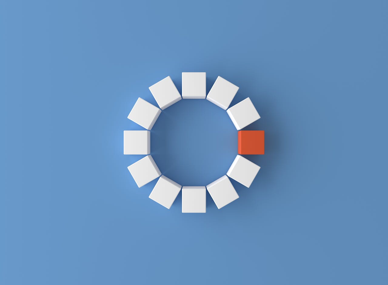
The logotype is sharp and geometric, inspired by pixel grids and building blocks. We created a dynamic mark using interlocking cubes that can shift, rotate, and animate across touchpoints — reinforcing the brand’s adaptable nature.
The color palette mixes deep charcoal, vibrant cyan, and muted neutral tones — giving it both clarity and confidence. Typography is clean and tech-friendly, but softened by rounded forms and generous spacing to ensure legibility in dense learning environments.
System and assets
We designed a flexible UI kit for the platform, with components that echoed the brand’s structure — cards, blocks, and progress modules that visually mirror the identity. Iconography was custom-built to maintain visual consistency, and motion principles were defined to support learning without distraction.
Marketing assets included brand guides, social templates, and a scalable graphic language that could work across both internal training tools and B2B materials.
Outcome
The Qubik identity gave the startup a strong foundation — memorable, modern, and fully systematized. It positioned them as a forward-thinking player in the e-learning space, helping them win early partnerships and build trust with both learners and institutions.
Related Projects
A selection of other projects we've worked on.


Drive Success
Join an entire ecosytem where one benefits from another, seamlessly.
0+
0+
Employees
Are working hard every day across all sites to make our results.
0M
0M
Profit Shared
With our employees, because we believe in shared wealth.